


Project 1: Flux Logo Design
This is my first logo design as part of an online graphic design course. First, I started by making dozens of sketches until I created an play button motif to make my design stand out.
Afterwards, I played with the motif and different types of fonts until I found one that meshed well with the play button.
Lastly, I played with different colors to create more detailed logos and possible app designs.
Project 2: Woven Logo Design
Woven was pitched to me as a messenger application used in digital devices to keep people connected. It was part of an 100 day logo design challenge that I participated in.
I incorporated what I was learning from my graphic design courses and created many different designs on paper and pencil. Then I fleshed out a particular design element that you see here in this final and more detailed sheet.


Project 3: The Golden Hop
The Golden Hop Logo Design is probably one of my favorite logo design assignments that I was given during my graphic design course.
We were not only creating the logo from scratch but we would be creating a brand identity and apply it to bottles, cans, signs, & more.
One of my challenges for this design is I wanted to bring an Art Deco motif to make it extravagant but fun. I was making the motif too extravagant and it overwhelmed the rest of the logo. I toned down the motif and eventually ended up with what you see here.
Tools Used:
1. Pencil & Paper
2. Adobe Creative Suite, specifically Photoshop, Illustrator, and Indesign


Process:
All of my concepts start out as a pen or pencil sketch on paper. First I look at similar logo work done by other artist to gather references and inspiration. If necessary, I will fill multiple pages thinking of a concept before I start the digital process.
During the digital process, I use methods of design like the golden ratio to create clean & timeless logos. The circles in the blue bird concept are different sizes of the golden ratio that correspond well to each other.
Example Design Sheet:
Once a concept is finalized, I use the design in many different color situations to make sure it will be a timeless and effective design. I also make a detailed version for special instances.
The work you see here is creating a logo design with the first letter of my name.

Other Projects
If you are interested in viewing my other work, here is some of the projects I did not cover, as well as parts of the process for some of the designs you have already seen.
For a more detailed look into my work, do not hesitate to contact me via my email mobile.mgravely5871@gmail.com
Lulu Lodging
Logo Concept for friends start up business.

Pet Life App Designs
Multiple Colorations for Pet Life, a company from my graphic design course.
Initial Golden Hop Designs
My first concepts for The Golden Hop Logo.
Initial Flux Logo Designs
Logo concepts for the company Audio Flux, this was part of my graphic design course.
Flower Logo Design
Color concepts for a logo designed using the grid method.
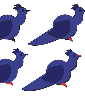
Golden Ratio Logo Design
A bird logo design using the golden ratio to create an appealing relationship between shapes within the design.
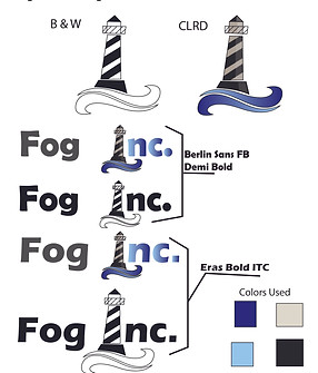
Fog inc. Logo Design
Lighthouse logo design from the 100 day logo design challenge.
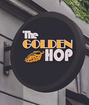
Golden Hop Sign
Quick concept of placing my logo design in a physical space.